Session 10: Advertising pages
10/02/23
This session made me realise the potential that my photos have because it is different to see them when they actually have a purpose. In this case they have to be convincing to make the costumer buy the product. It felt like something that would be difficult at first but different adds started to come together when I focused on the main element of each image. Like for example if a logo was clear then focus on that brand, or if a specific style reminded me of a brand.
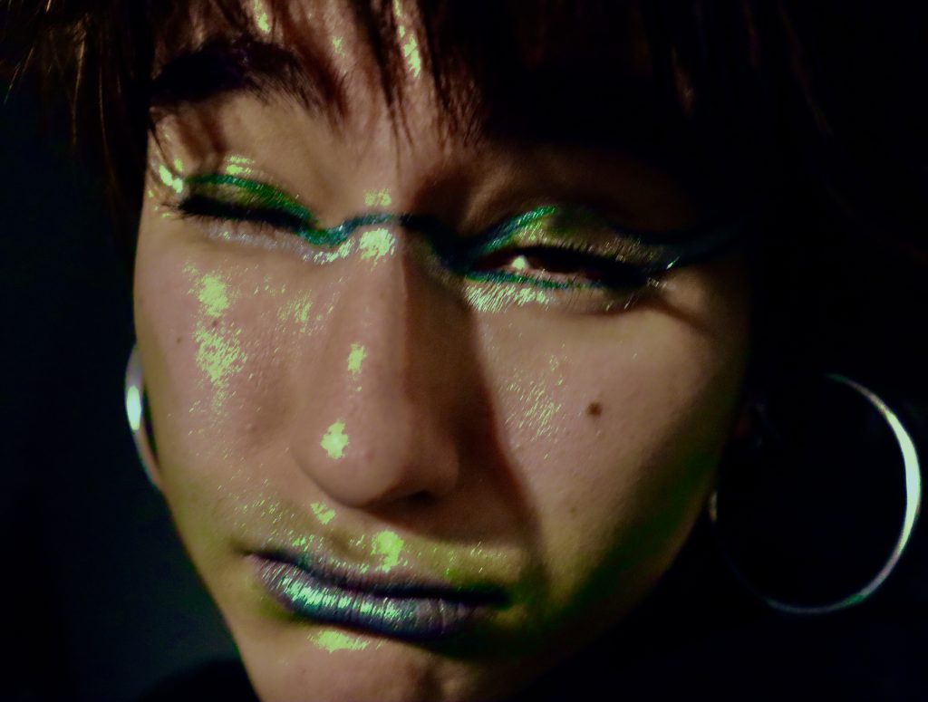
The next step was to choose the images and decide how to pace the logos. Some worked straight away but others didn’t really seem like the image fitted with the brand. One example of this is Calzedonia, it’s a brand that sells tights and I used it with an image where I show a bright pink tight I was wearing. It did not really work because the image had too many things going on and the focus was not completely on the tights. An example where the opposite happened is in the NARS advertisement, I used the makeup photos from the SDS which where specifically directed for that product. It clearly showed that it was advertising makeup because of the close up shots of the face and the way I edited to make the colours stand out.
The advertisements:
SDS:
Leave a Reply